How to fix a website that breaks on a phone
Your desktop rankings are computed from the phone rendering. Google indexes with Googlebot Smartphone, so what a phone cannot reach is not indexable.
Your desktop rankings are computed from the phone rendering. After July 5, 2024, Google crawls and indexes for Search with Googlebot Smartphone, and John Mueller stated the consequence in one sentence: "If your site's content is not accessible at all with a mobile device, it will no longer be indexable." Googlebot Desktop still shows up in server logs, because a few Search features kept it, product listings and Google for Jobs among them. The main index is not one of them.
There is no desktop index to fall back on. The laptop version you are proud of is not the version being scored.
What this actually is
"Mobile-first indexing" is a misnomer. It sounds like an ordering, a first pass followed by a second. It is the only pass.
Google announced on October 31, 2023 that the migration was complete, leaving only "a very small set of sites which do not work on mobile devices at all" on the legacy desktop crawler. On June 3, 2024 Google closed that exception: those remaining sites would be crawled with mobile Googlebot after July 5, 2024.
That leaves two failure classes, and they cost you different things.
The first is content Google cannot get at all. Google named the error types it saw on the holdout sites: pages that show errors to all mobile users, a mobile version blocked in robots.txt while desktop is allowed, and all mobile pages redirecting to the homepage. These do not lower your ranking: they remove the page from the index.
The second is content a human cannot use. Horizontal scrolling, text you have to pinch to read, buttons your thumb misses, a popup over the article. Google's page experience guidance asks two questions directly about this: "Does your content display well on mobile devices?" and "Do your pages avoid using intrusive interstitials?"
Underneath most of the second class sits one missing line of HTML. Without a viewport meta tag, a phone browser renders your page into a virtual window wider than the screen and shrinks the result to fit: MDN gives 980px as the illustrative virtual viewport. Your breakpoints are then measured against that 980px rather than against the glass in the reader's hand, so every one written below it never matches. MDN states the tag's job in exactly those terms: it exists "as a way to control how mobile browsers render content, making sure they respect your media queries." Your responsive CSS is present, loaded, and silent.
How to check
The tool most guides still name no longer exists. Google retired the Mobile-Friendly Test and the Mobile Usability report on December 1, 2023, and stamped the retirement notice on top of its own announcement page for the tool. Anything telling you to "run the Mobile-Friendly Test" was written before that date. Use these five instead, in this order.
1. Lighthouse, mobile preset. Chrome DevTools, F12, Lighthouse panel, Device set to Mobile. Or run it on Google's hardware at pagespeed.web.dev, which takes your laptop's CPU out of the result. This is where Google redirected the retired tool's traffic. Tick Accessibility alongside SEO and Performance, because the tap-target check moved into that category in Lighthouse 12 and an SEO-only run will not show it.
2. DevTools device mode at two widths. F12, then Ctrl+Shift+M (Cmd+Shift+M on macOS). Set Responsive and type the width by hand: 360, then 375. 360 is the common Android width, 375 is the iPhone SE class. Test both. A layout that survives 375 and dies at 360 is a fixed width hiding in a sidebar.
3. The overflow hunt. Device mode shows that the page scrolls sideways, not which element is doing it. Paste this into the console:
const w = document.documentElement.clientWidth;document.querySelectorAll('*').forEach(el => { const r = el.getBoundingClientRect(); if (r.right > w + 1 || r.left < -1) console.log(Math.round(r.width), el);});
It logs every element whose box crosses the viewport edge. Read from the bottom of the list up: the deepest child is usually the culprit, and everything above it is a parent stretched by that child.
4. A real phone, over USB. Chrome's remote debugging connects DevTools on your laptop to the page running in Chrome on your Android device. Google is blunt about why this matters: device mode is "a first-order approximation," because "the architecture of mobile CPUs is very different than the architecture of laptop or desktop CPUs." Emulation gets you the layout. It does not get you touch behaviour, a real thumb, the real network, or the real CPU.
5. Search Console URL Inspection, live test. Inspect the URL, choose Test Live URL, then View Tested Page and open the Screenshot tab. That is what Google-InspectionTool fetched and rendered just now on Google's own infrastructure: the only one of the five showing Google's rendering rather than a proxy for it. Hold on to what it is not. A live test reports what Google can reach today, not what sits in the index, and Google is direct about the limit: "The live URL test only confirms if Google-InspectionTool can access your page for indexing." For the indexed version, read the crawled result in the same panel.
What you will see
Each state maps to one cause.
A shrunken desktop layout, all text tiny, everything proportional. Missing or malformed viewport meta tag. Nothing else produces that specific look.
A horizontal scrollbar, or content sliding sideways under your thumb. One element is wider than the viewport. The console snippet names it.
Type you have to pinch to read, with the layout otherwise intact. Body copy set in pixels below the browser default. Nothing will flag it for you now: Lighthouse removed the "Document doesn't use legible font sizes" audit in version 13, released October 10, 2025, on the reasoning that "there are no signals that this remains an SEO concern today." The audit is gone. The reader is not.
Lighthouse: "Touch targets do not have sufficient size or spacing." This is the target-size audit under Accessibility, which took over from the retired SEO audit "Tap targets are not sized appropriately" in Lighthouse 12. Check which categories you ran before you conclude the page is clean. Size alone does not fail it: crowding does.
The Search Console screenshot shows less content than your desktop page. A parity problem, and the expensive one.
The screenshot is mostly a popup. An interstitial, rendered exactly as a searcher would meet it.
The screenshot is blank or errors. Class one. Nothing is indexed from this page. Check robots.txt for a mobile-specific disallow, and check whether the page depends on JavaScript that failed.
How to fix
Set the viewport tag. In <head>, before your stylesheets:
<meta name="viewport" content="width=device-width, initial-scale=1">
Do not add user-scalable=no or maximum-scale=1. MDN's warning is explicit: disabling zoom "prevents people experiencing low vision conditions from being able to read and understand page content," and WCAG requires a minimum of 2x scaling. iOS 10 and later ignores the instruction anyway, so you get the accessibility failure without even getting the behaviour you asked for. Ouch.
Kill the overflow at the element, not at the body. The tempting fix is body { overflow-x: hidden }. That is a tourniquet: the broken element is still there, still pushing, and hidden overflow can break position: sticky further up the tree. Fix the culprit. Four of them, in order of how often they turn up:
- Fixed pixel widths. Replace width: 640px with max-width: 640px; width: 100%. Then set *, *::before, *::after { box-sizing: border-box } so padding and borders stop adding to that width.
- Images. One rule, applied globally: img, video, iframe { max-width: 100%; height: auto }. An unconstrained 2000px hero is the single most common cause.
- Wide tables. Do not restyle the table. Wrap it in a <div> with overflow-x: auto. The table keeps its columns, the scroll is contained, and the page stops moving. Add table-layout: fixed if columns still fight.
- Long unbroken strings. URLs, API keys, German compound nouns, an email address in a testimonial. overflow-wrap: anywhere on the container holding prose. Use anywhere rather than break-word when the string sits in a flex or grid item, because it also affects the intrinsic minimum width.
There is a fifth, quieter one: a grid or flex item whose content refuses to shrink. Both default to a minimum size of auto, meaning "at least as wide as my content." Set min-width: 0 on the item and it will finally give.
Size the tap targets. The number the tool checks is no longer 48. Lighthouse 12 retired the SEO tap-target audit and handed the job to target-size under Accessibility, which applies WCAG 2.2: 24 by 24 CSS pixels at Level AA (2.5.8), 44 by 44 at AAA (2.5.5), with an exception letting an undersized target pass if a 24px circle centred on it does not intersect the circle of a neighbour. That exception is why there is no single clearance number to code to: the gap you need grows as the target shrinks. One number settles all of it. Build to 48 by 48 and you clear AA outright, clear AAA with margin, and never have to work out the circles.
The implementation detail that matters: put the padding on the anchor or button itself, not on the list item wrapping it. A 14px link inside a 48px <li> still has a 14px tap target.
Set the type. With the audit retired there is no tool number left to chase, so take the floor from the browser itself. MDN puts the default at 16px: "1em will equal the default browser font-size, which is usually 16px." Set body copy at 1rem and scale from there in rem rather than px, because MDN is blunt about what pixels cost: font sizes in px are "not accessible", since "the user cannot change the font size in some browsers". A reader who raised their default text size gets nothing back from a page that hardcodes pixels.
Find what you already have the same way you found the overflow:
document.querySelectorAll('p, li, td, a, span, label, input, button').forEach(el => { const px = parseFloat(getComputedStyle(el).fontSize); if (px < 16 && el.textContent.trim().length > 15) console.log(px + 'px', el);});
Footers, captions, form labels, and legal text are where the 11px and 13px declarations hide.
Restore content parity. This is the one that costs rankings rather than comfort. Google's mobile-first best practices are unambiguous: "Make sure that your mobile site contains the same content as your desktop site," and if the mobile version has less, "you can expect some traffic loss." The same doc extends parity to three things people forget: identical structured data, identical title and meta description, and identical robots meta tags, warning that a noindex present only on the mobile version means "Google may fail to crawl and index your page."
The reframe that changes behaviour: your mobile template is not a reduced version of the page, it is the page. Anything missing from the mobile page Google finally holds is missing from the index. That is not an argument against JavaScript. Google runs it: "a headless Chromium renders the page and executes the JavaScript," and "Google also uses the rendered HTML to index the page." Hiding content with CSS at a breakpoint is fine on the same logic, because the markup stays in the DOM. The failures are the ones that change the document itself: server-side device detection, or a separate m. subdomain emitting a shorter page.
And do not defer primary content behind a gesture. Google states it plainly: "Don't lazy-load primary content upon user interaction. Google won't load content that requires user interactions (for example, swiping, clicking, or typing) to load." Googlebot does not swipe your carousel.
Deal with the interstitial. Google named three techniques: a popup covering the main content on arrival from search or during reading, a standalone interstitial the user must dismiss before reaching the content, and a layout where the above-the-fold area looks like a standalone interstitial with the real content inlined below the fold. That third one is the sneaky one, and it is what most "welcome mat" designs are.
Three categories are explicitly not affected when used responsibly: interstitials responding to a legal obligation such as cookie consent or age verification, login dialogs on sites where the content is not publicly indexable, and banners that, in Google's words, "use a reasonable amount of screen space and are easily dismissible". Your newsletter signup is not a legal obligation. Move it inline, or make it a dismissible bar.
Override only what breaks. If the site was built desktop-first, the instinct is a full mobile-first rewrite. Resist it for one release. Add the viewport tag, then load one override stylesheet last, containing a single @media (max-width: 48em) block that does four things: sets fixed widths to auto or 100%, collapses multi-column layouts to one column, removes floats and absolute positioning used for columns, and applies the image and table rules above. That gets a usable, indexable page in a working day.
Then migrate. The end state is mobile-first: the base stylesheet holds the single-column layout with no media query around it, and min-width breakpoints add columns as space appears. Breakpoints go where your content breaks, not at device names, because device names change every autumn and your content does not. For the grids themselves, grid-template-columns: repeat(auto-fit, minmax(16rem, 1fr)) reflows without a single breakpoint.
Two stylesheets describing two layouts is the trap: every change has to be made twice, and one of the two will drift.
What it costs
The viewport tag: ten minutes, plus whatever your deploy takes.
The overflow hunt: one to three hours per template. The console snippet is fast; deciding what the element was supposed to do takes the time.
Tap targets and type scale: an afternoon if your CSS has anything resembling design tokens, two days if every button carries its own padding.
Content parity: hours if desktop and mobile share one template, weeks if you are retiring a separate mobile site. This is the one that turns into a project.
The override sheet: a day for a five-template site. The mobile-first migration behind it: two to four weeks, and it is a rewrite of the CSS rather than an adjustment to it.
Then the wait, which is not yours to control. Google has to recrawl before the fix counts. URL Inspection's Request Indexing covers a handful of URLs by hand; everything else arrives on Google's own crawl cadence, and there is no published number for how long that takes. Fix it, submit the important pages, and stop refreshing.
Not sure which of these your site has? Run a free web audit and get the mobile rendering, the overflow, and the parity gaps in one report.
References
Mobile-indexing-vLast-final-final.doc - Google Search Central Blog, June 3, 2024Mobile-first indexing has landed - Google Search Central Blog, October 31, 2023Mobile-first Indexing Best Practices - Google Search CentralThe Search Console mobile friendly testing tool (retired) - Google Search Central Blog, carrying the December 1, 2023 retirement noticeHelping users easily access content on mobile - Google Search Central Blog, the intrusive interstitials guidanceUnderstanding page experience in Google Search results - Google Search CentralURL Inspection Tool - Google Search Console HelpLighthouse overview - Chrome for DevelopersPageSpeed Insights - GoogleTap targets are not sized appropriately - Chrome for Developers, the SEO audit retired in Lighthouse 12Document doesn't use legible font sizes - Chrome for Developers, carrying the Lighthouse 13 removal noticeWhat's new in Lighthouse 13 - Chrome for Developers, October 10, 2025Lighthouse changelog - GoogleChrome/lighthouse, recording the 12.0.0 move fromtap-targets to target-sizeTarget size (target-size) - Deque University, the rule Lighthouse now runsUnderstand JavaScript SEO basics - Google Search Centralfont-size - MDN Web DocsBeginner's guide to media queries - MDN Web DocsSimulate mobile devices with device mode - Chrome for DevelopersRemote debug Android devices - Chrome for DevelopersViewport meta element - MDN Web DocsUnderstanding SC 2.5.8: Target Size (Minimum) - W3C Web Accessibility InitiativeUnderstanding SC 2.5.5: Target Size (Enhanced) - W3C Web Accessibility InitiativeResponsive web design basics - web.devUsing media queries - MDN Web Docsoverflow-wrap - MDN Web Docsbox-sizing - MDN Web Docsmax-width - MDN Web Docstable-layout - MDN Web Docsminmax() - MDN Web DocsElement.getBoundingClientRect() - MDN Web DocsBy Jesper Jurcenoks
Next in the series
How to fix a website that breaks on a phone
Your desktop rankings are computed from the phone rendering. Google indexes with Googlebot Smartphone, so what a phone cannot reach is not indexable.
2026-08-18
Google picked a different version of your page: fixing duplicate URLs and canonicals
Your page is indexed. Google just indexed a different URL of it than the one you promote and track. Pick one form, redirect the rest, make the signals agree.
2026-08-18
How to find and remove a noindex tag or robots.txt block that keeps your site out of Google
Your site is not missing from Google. It is being refused, on your own instruction. Three mechanisms can issue it, and two leave nothing in your HTML.
2026-08-18
Only your homepage is indexed: how to get Google to find the rest of your site
Google indexes what it can reach. If only your homepage is indexed, your pages are not being outranked: they are not being found. Internal links come first.
2026-08-18
How to get backlinks for a small business
Of the nine reasons your site is missing from Google, links are the one you control least. Fix the other eight first, then claim the links you are owed.
2026-08-18
How to get Google to index a new website
If your site went live in the last few weeks, the likely explanation is the boring one: Google has not got to you yet. What shortens the wait, and what does not.
2026-08-18
How to make your website faster and pass Core Web Vitals
Compressing your images will not fix this. Three numbers decide whether Google calls your site fast, and two are set by your architecture, not your assets.
2026-08-18
How to show up in local Google search when you serve a town
Your website is not your entry on the map. The map pack is fed by a Google Business Profile, a separate record you must claim and verify to compete on it.
2026-08-18
My page is indexed but gets no traffic: how to make it answer the question
Your page is not missing from Google. It is present and unwanted. Search Console tells you which problem you have: not being shown, or shown and not chosen.
2026-08-18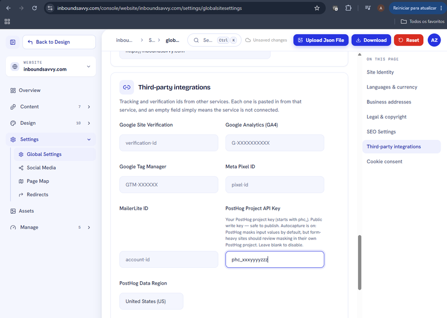
Set Up PostHog Analytics for Your Website
PostHog shows what visitors actually do on your site. InboundSavvy has it built in: one token, one dropdown. Includes how to connect PostHog's MCP server so your AI assistant can query the data.
2026-08-05
How to Get Your Small Business Found on Google in 2026
Getting found on Google changed with AI Overviews and AI Mode. Here's what actually moves the needle for a small business in 2026 - in plain English, no jargon.
2026-07-01
Why Isn't My Website Showing Up on Google? (9 Reasons + Fixes)
Nine reasons a small-business site does not appear in Google, each with the exact check that identifies it and the actual repair. Including what Search Console and Lighthouse each tell you, and why they disagree.
2026-06-28
The Small-Business Website SEO Checklist for 2026
SEO for a small business comes down to a handful of things done well. Here's a practical 2026 checklist, grouped by what each item actually does for you.
2026-06-25
Let Claude Edit Your Website: Connecting InboundSavvy to Claude Code
A non-technical guide to setting up InboundSavvy's MCP integration with Claude Code - one prompt, a few clicks, and AI starts building your website.
2026-05-25Other articles
How to fix a website that breaks on a phone
Your desktop rankings are computed from the phone rendering. Google indexes with Googlebot Smartphone, so what a phone cannot reach is not indexable.
2026-08-18Google picked a different version of your page: fixing duplicate URLs and canonicals
Your page is indexed. Google just indexed a different URL of it than the one you promote and track. Pick one form, redirect the rest, make the signals agree.
2026-08-18How to find and remove a noindex tag or robots.txt block that keeps your site out of Google
Your site is not missing from Google. It is being refused, on your own instruction. Three mechanisms can issue it, and two leave nothing in your HTML.
2026-08-18Only your homepage is indexed: how to get Google to find the rest of your site
Google indexes what it can reach. If only your homepage is indexed, your pages are not being outranked: they are not being found. Internal links come first.
2026-08-18How to get backlinks for a small business
Of the nine reasons your site is missing from Google, links are the one you control least. Fix the other eight first, then claim the links you are owed.
2026-08-18How to get Google to index a new website
If your site went live in the last few weeks, the likely explanation is the boring one: Google has not got to you yet. What shortens the wait, and what does not.
2026-08-18How to make your website faster and pass Core Web Vitals
Compressing your images will not fix this. Three numbers decide whether Google calls your site fast, and two are set by your architecture, not your assets.
2026-08-18How to show up in local Google search when you serve a town
Your website is not your entry on the map. The map pack is fed by a Google Business Profile, a separate record you must claim and verify to compete on it.
2026-08-18My page is indexed but gets no traffic: how to make it answer the question
Your page is not missing from Google. It is present and unwanted. Search Console tells you which problem you have: not being shown, or shown and not chosen.
2026-08-18Set Up PostHog Analytics for Your Website
PostHog shows what visitors actually do on your site. InboundSavvy has it built in: one token, one dropdown. Includes how to connect PostHog's MCP server so your AI assistant can query the data.
2026-08-05How to Get Your Small Business Found on Google in 2026
Getting found on Google changed with AI Overviews and AI Mode. Here's what actually moves the needle for a small business in 2026 - in plain English, no jargon.
2026-07-01Why Isn't My Website Showing Up on Google? (9 Reasons + Fixes)
Nine reasons a small-business site does not appear in Google, each with the exact check that identifies it and the actual repair. Including what Search Console and Lighthouse each tell you, and why they disagree.
2026-06-28The Small-Business Website SEO Checklist for 2026
SEO for a small business comes down to a handful of things done well. Here's a practical 2026 checklist, grouped by what each item actually does for you.
2026-06-25Let Claude Edit Your Website: Connecting InboundSavvy to Claude Code
A non-technical guide to setting up InboundSavvy's MCP integration with Claude Code - one prompt, a few clicks, and AI starts building your website.
2026-05-25